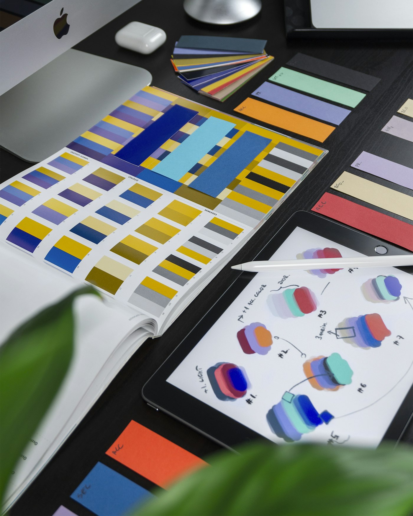
Design here means the order of screens and the decisions a person has to make, as well as the visual finish. We document both so development does not guess.
Website design
Page types, typography, and components for a public site that has to stay consistent as content grows.
Application interfaces
Screens for repeated tasks, with states for empty, loading, error, and success.
Wireframing
Low-fidelity layouts used to agree structure before visual design.
Prototyping
A clickable sequence for the main journey, so stakeholders can react to the flow.
User experience optimization
A review of an existing product: where people hesitate, and which changes are worth making first.
Key features
A component set
Buttons, forms, and cards are defined once and reused.
Content hierarchy
Headings and spacing make the next action obvious.
Documented states
Empty and error screens are designed, not invented during development.
Handoff notes
Spacing, type, and behaviour are written down for the people who will build it.
Benefits
- Fewer redesign loops. Structure is agreed before pixels are polished.
- Interfaces that match the task. Decoration does not hide the action.
- A system later screens can follow. New pages do not each invent a new style.
Technologies used
Our development approach
We begin with the tasks and the content, sketch the flow, and only then apply the visual system. Development starts from the agreed screens, including the states that are easy to forget.